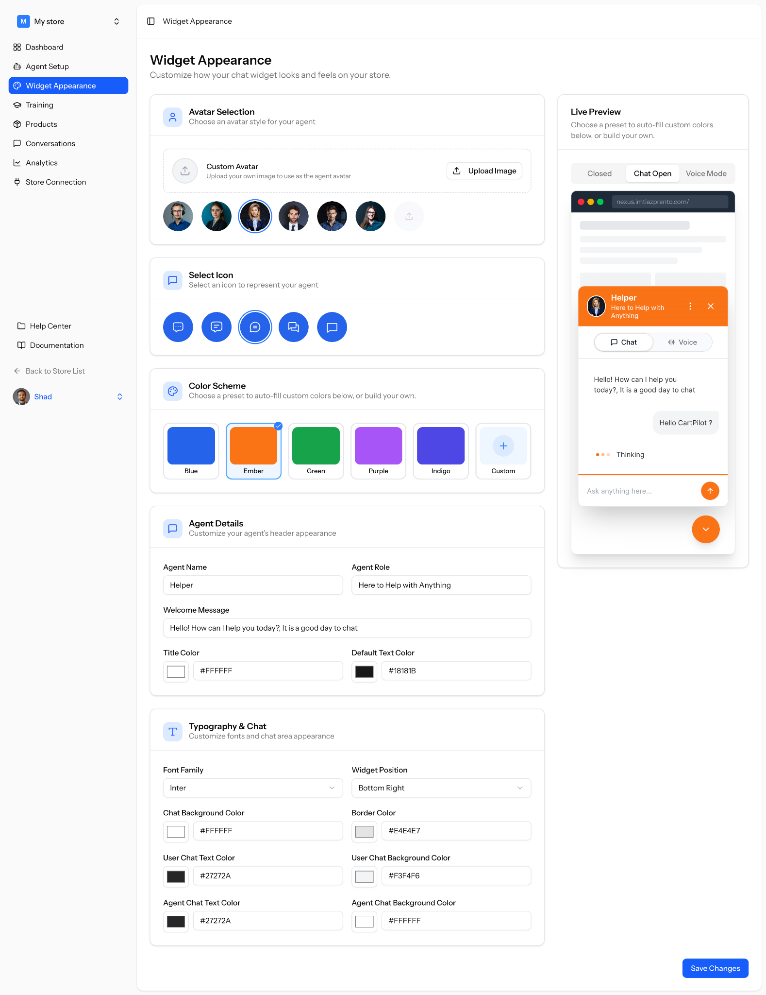
The Widget Appearance section lets you customize how the CartPilot chat widget looks and feels on your store.
You can change the agent avatar, chat icon, color scheme, agent details, typography, widget position, and chat colors. You can also preview the widget in real time before saving your changes.
Where to Find Widget Appearance
You can change the widget apperance from the CartPilot dashboard, or by navigating to your WordPress Dashboard > CartPilot > Widget Appearance.
Here, you will see all customization options on the left and a live preview of your chat widget on the right.
Avatar Selection
The avatar represents your AI agent inside the chat widget.
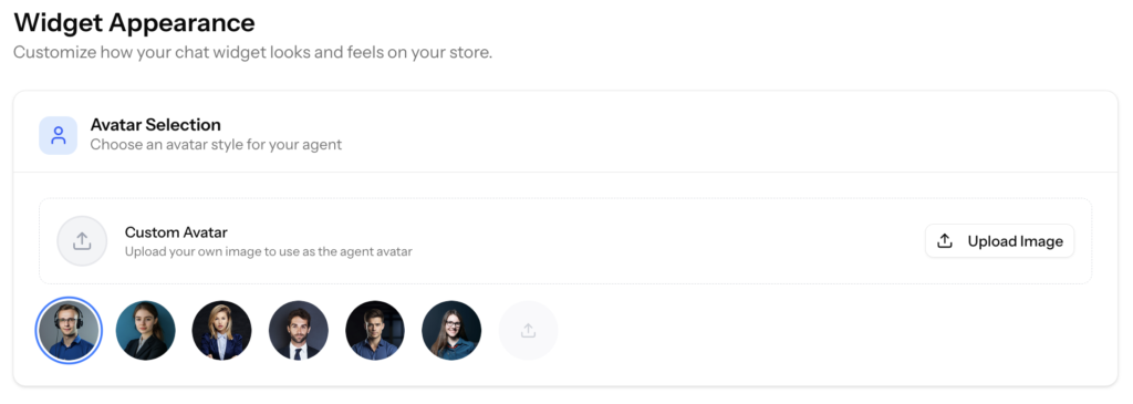
You can choose one of the available avatar styles or upload your own custom avatar.
To add a custom avatar:
- Go to the Avatar Selection section
- Click Upload Image
- Choose an image from your device
- Select the avatar you want to use
Your selected avatar will appear in the widget header and chat preview.
Select Icon
The chat icon is the small icon customers see when the widget is closed or minimized.
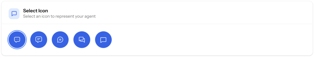
You can choose from the available icon styles to match the look and feel of your store.
To select an icon:
- Go to the Select Icon section
- Choose your preferred icon
- Check the live preview to see how it looks
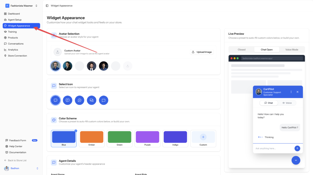
Color Scheme
CartPilot includes ready-made color presets to help you quickly style your widget.
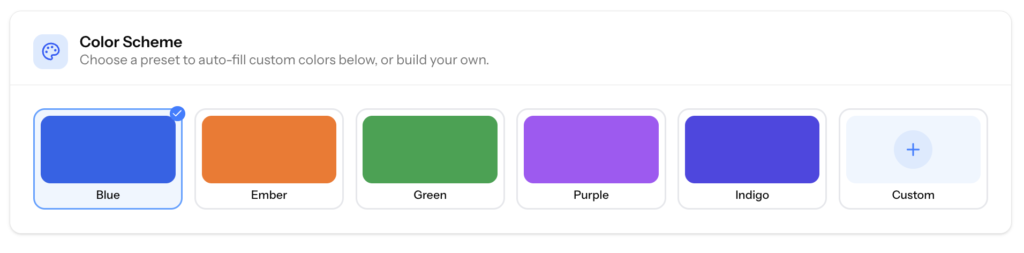
Available color options include:
- Blue
- Ember
- Green
- Purple
- Indigo
- Custom
Choose a preset to apply the main widget colors automatically. You can also select Custom if you want to use your own brand colors.
Agent Details
The Agent Details section controls the information shown in your widget header and greeting area.
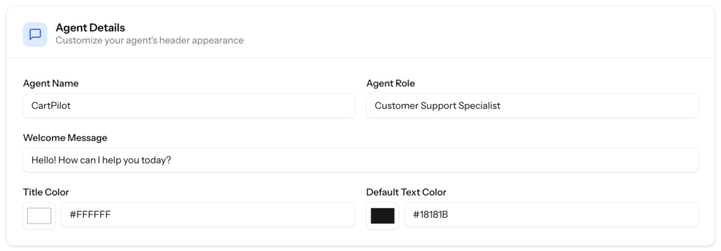
You can customize:
- Agent Name
- Agent Role
- Welcome Message
- Title Color
- Default Text Color
For example, you can set the agent name as Helper and the role as Here to Help with Anything.
The welcome message is the first message customers see when they open the chat widget, so keep it short, friendly, and helpful.
Typography and Chat
The Typography and Chat section lets you control the visual style of the chat area.
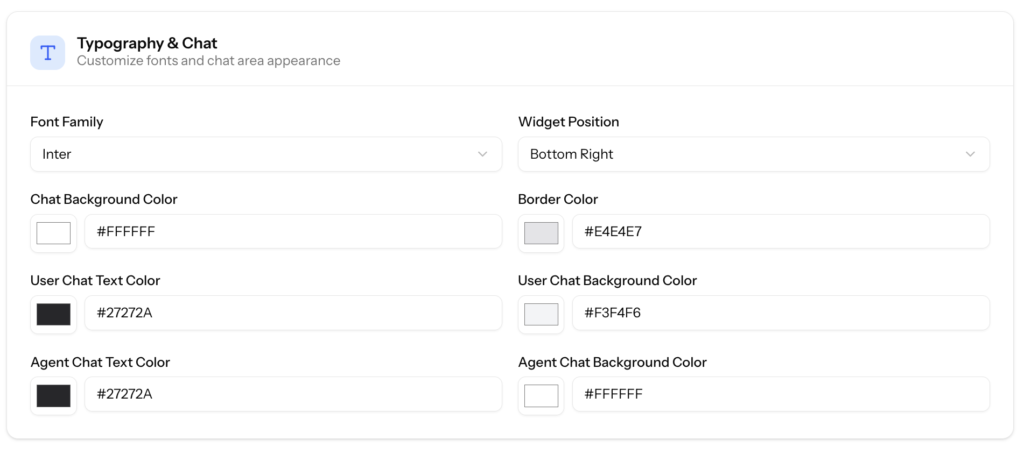
You can customize:
- Font Family
- Widget Position
- Chat Background Color
- Border Color
- User Chat Text Color
- User Chat Background Color
- Agent Chat Text Color
- Agent Chat Background Color
Use these options to make the widget match your store design. For example, you can place the widget at the bottom right, choose your preferred font, and set different background colors for customer and agent messages.
Live Preview
The Live Preview panel shows how your widget will look on your store.
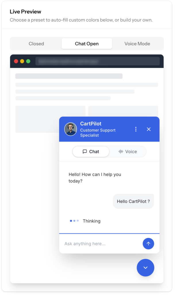
You can preview different widget states:
- Closed
- Chat Open
- Voice Mode
This helps you check the design before applying it to your live store.
Save Your Changes
After customizing the widget, click Save Changes.
Your updated widget appearance will be applied to your connected store.
Tips for Better Widget Design
- Use colors that match your store branding
- Keep the agent name short and easy to understand
- Write a friendly welcome message
- Make sure text colors are easy to read
- Preview the widget before saving
- Test both chat and voice mode after publishing
Once your widget appearance is ready, you can continue setting up your products, training data, and agent behavior.